Tutorials
Below are descriptions of the several Divi Modals that contain controls for designing the appearance of the Explorable Map. Also, you will find snippets, as they become available, that can be applied outside of the module to further aid in the design or appearance of the map.
CONTENT - MAP: exploring the Content Tab in Builder
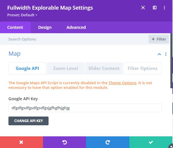
Google API: As reference, the Divi Theme Options General setting for "Enqueue Google Maps Script" DOES NOT need to be Enabled unless you use the Divi Map modules or possibly other map modules elsewhere in your site. The message seen here indicates that this setting has NOT been enabled. The KK module will enqueue the necessary Google scripts.
Your Google Maps API key does need to be set in Theme Options and must include the apis as explained in the Getting Started tutorial.
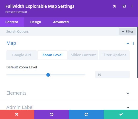 Default Zoom Level: The default initial zoom level is set here. Depending on the number and spread of the markers added to the map, the zoom level will determine how many will be seen initially.
Note that the marker generated from the most recent Listing added will at the center of the map when it is rendered.
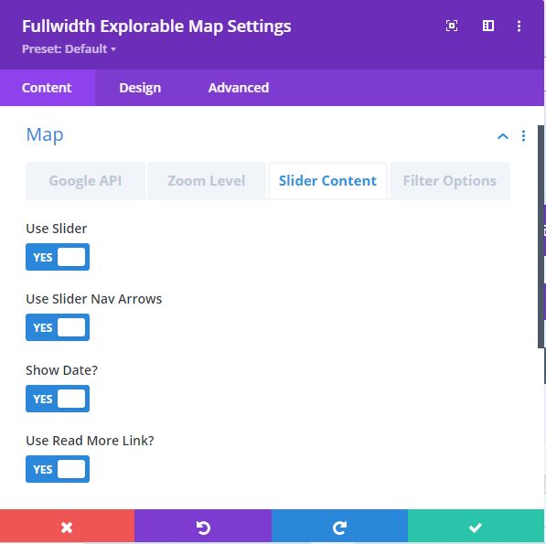 Use Slider: this controls the full display of the Slider. If "NO", then the Slider will be hidden completely. If used, the Slider can be repositioned by dragging.
Use Slider Nav Arrows: if the Slider is used, then the Next/Prev arrows can be hidden. If hidden, the Slider will initially be positioned to the far left of the map display.
Show Date?: if "NO", then the block at the top of the Slider showing the published Date of the Listing will not be shown.
Use Read More Link?: this is the link at the bottom of the Slider otherwise read as "More Information." This link is intended for display of the full single Listing post and will redirect.
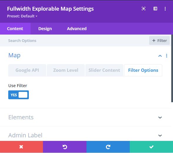
Filter Options: the lone option here is to use the filter or not. "NO" will hide the Filter Bar and the Map will extend into that area.
CONTENT - ELEMENTS: exploring the Content Tab in Builder
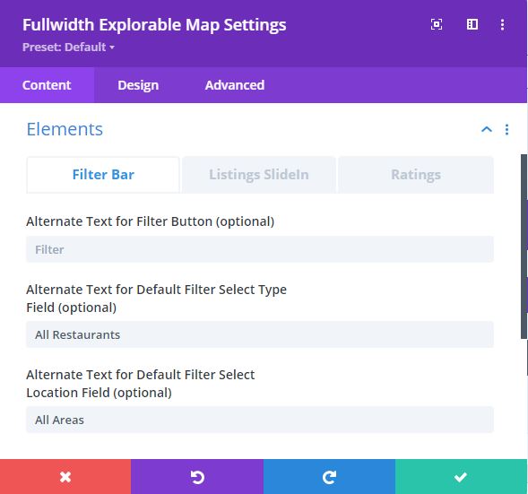 Alternate Text for Filter Button: this option allows changing the default wording within the Filter Bar button.
Alternate Text for Default Filter Select Type Field: depending on how the Listings are "Typed", this option allows changing the default wording ("All Listing Types") to reflect the Map theme.
Alternate Text for Default Select Location Field: as in the above, this option allows changing the default wording ("All Locations") to reflect the Map theme.
Note: the Filter itself uses the Type (category) and Location (tag) taxonomy to "query" which Listings will be shown. Exercising the Filter does not re-render the map, however, once submitted, the map will pan to the Listing marker that appears first in the Results List.
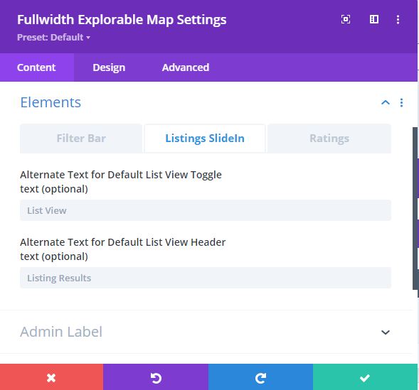
AlternateText for Default List View Toggle: this option allows for changing the default wording on the SlideIn button. It is optional, as shown. Due to the CSS for rotation being applied it may be necessary to adjust the CSS positional "left" setting. This can be done in the Advanced CSS panel for this element.
Alternate Text for Default List View Header: this option allows changing the default wording for the top header text in the SlideIn List View panel.
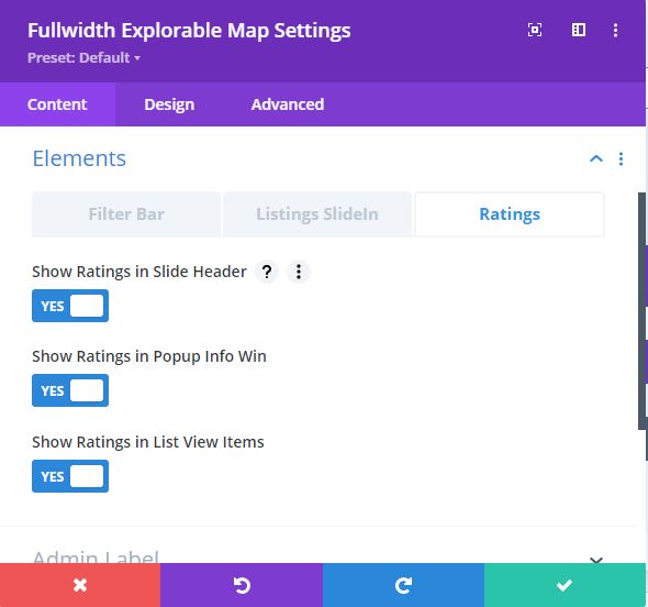 Show Ratings in Slide Header: this option allows showing or hiding the Ratings graphic in the Slider Header section.
Show Ratings in Popup Info Win: this option allows showing or hiding the Ratings graphic in the popups associated with the Map Markers.
Show Ratings in List View Items: this option allows showing or hiding the Ratings graphic in the List View items panel.
DESIGN - CONTROLS: exploring the Design Tab in Builder
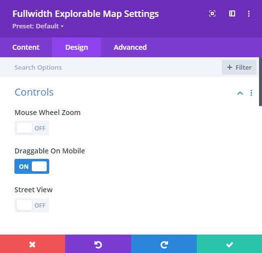 Mouse Wheel Zoom: this control allows using the mouse wheel (if equipped) to control zooming while hovering the mouse pointer over the map. This may or may not be advisable depending on the map construct. Draggable On Mobile: this control allows dragging the map on mobile devices. Here, again, this may or may not be advisable. Street View: this will allow the map to go into a Street View mode. This may also be inadvisable except for intentional purposes.
DESIGN - COMMON ELEMENTS: exploring the Design Tab in Builder
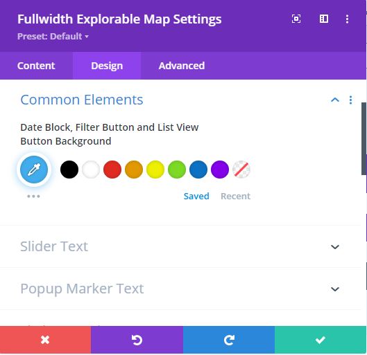 Date Block, Filter Button and List View Button Background: this single setting controls the background color of the three block items listed. This is intended to keep the general motif of three items common.
DESIGN - SLIDER TEXT: exploring the Design Tab in Builder
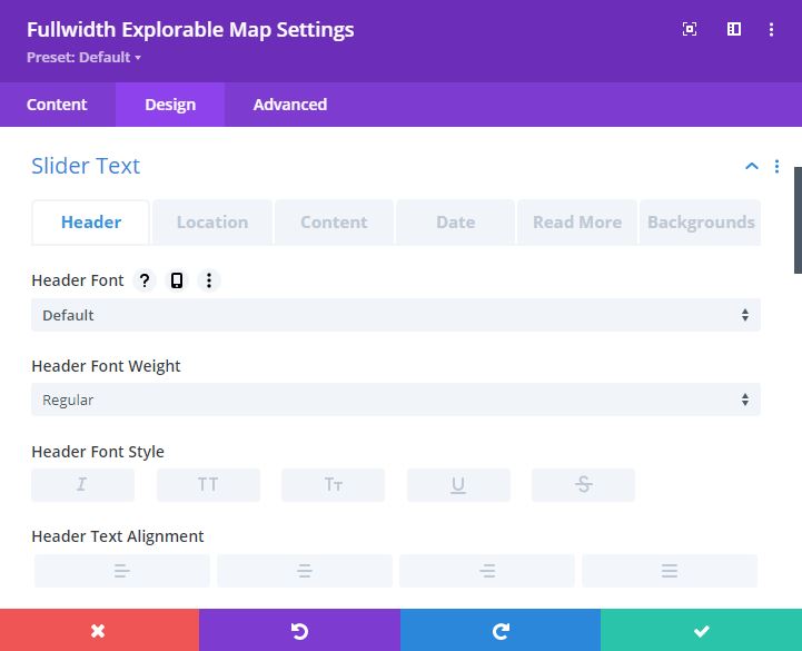
Header, Location, Date and Read More (More Information): these four control tabs have identical Text controls. These should be familiar in that the grouping of the sub-controls are the same found in many Divi modules.
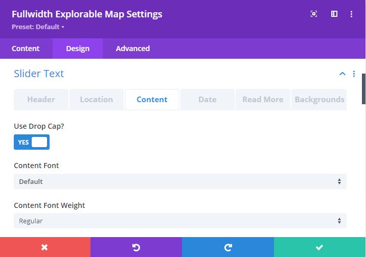 This is identical to the other tabs here that style text components.
Use Drop Cap?: this toggle determines if the Drop Cap styling of the first character is styled as such in the Slider text body.
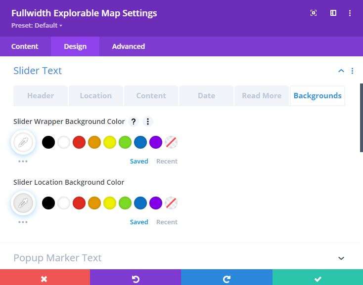 Slider Wrapper Background Color: this is the background color of the entire Slider panel.
Slider Location Background Color: this the background color of the strip which shows the Location or address given in the Listing post.
DESIGN - POPUP MARKER TEXT: exploring the Design Tab in Builder
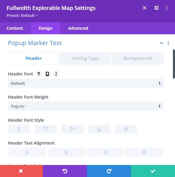 Header, Listing Type: these are the general text settings for the marker Info Windows. The Header is the Listing title and Listing Type is the category.
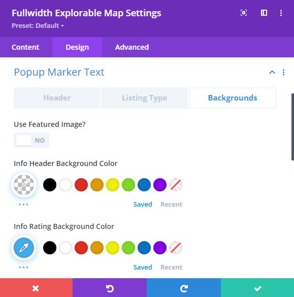 Use Featured Image?: this option allows using the featured image as a background in the marker Info Window.
Info Header Background Color: set the background color of the Header portion. The Featured Image takes precedence, if used.
Info Rating Background Color: if Ratings are used, this allows setting a different background color. This may be useful when the "Buttons" common color is changed.
DESIGN - LISTING RESULTS TEXT: exploring the Design Tab in Builder
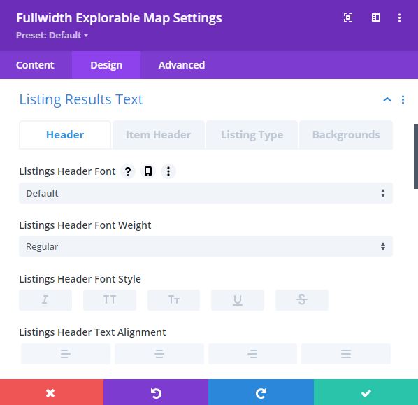 Header, Item Header and Listing Type: these three tabs allow text styling of the various portions of Listings panel.
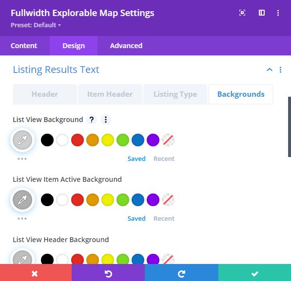 Backgrounds: these controls allows changing the default background colors as noted.
DESIGN - FILTER TEXT: exploring the Design Tab in Builder
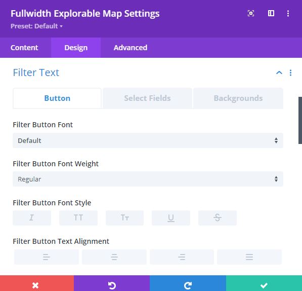 Button and Select Fields: design the Text of the Filter Button and both of the Types/Location select fields.
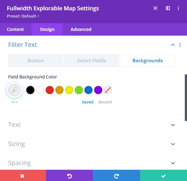 Select Fields Background Color: this control is for designing the background color of the two Select fields.
The background color of the Filter button is controlled elsewhere collectively with the Date block in the Slider and the List View button.
